High-fidelity screens that look finished and function logically.
Interface Design is the phase where digital products acquire the visual language that users will spend hours navigating. Done well, it is invisible — the user simply understands. Done badly, every screen requires a moment of interpretation that compounds into frustration.
We design interfaces from approved wireframes or from a product brief with an agreed structure. The visual design phase is not where structural decisions are made — those should already be resolved. What we are doing here is building the visual system that communicates those structures.
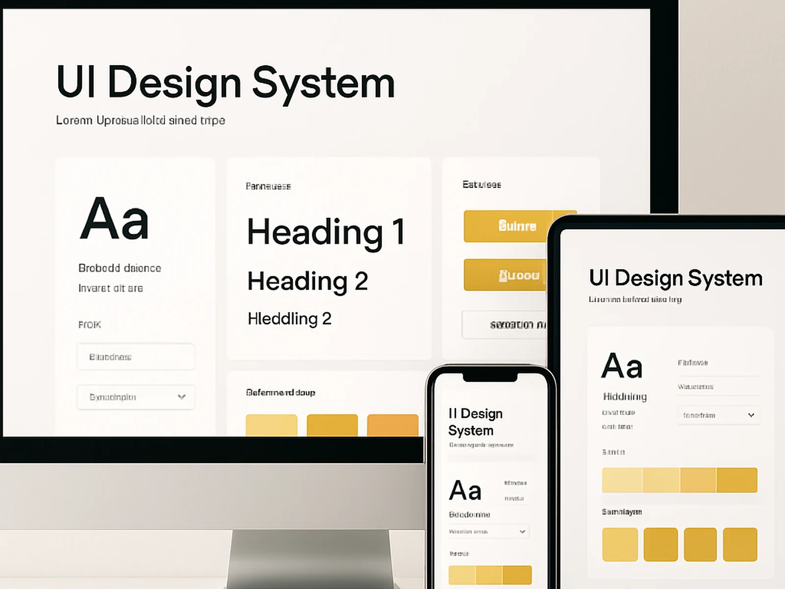
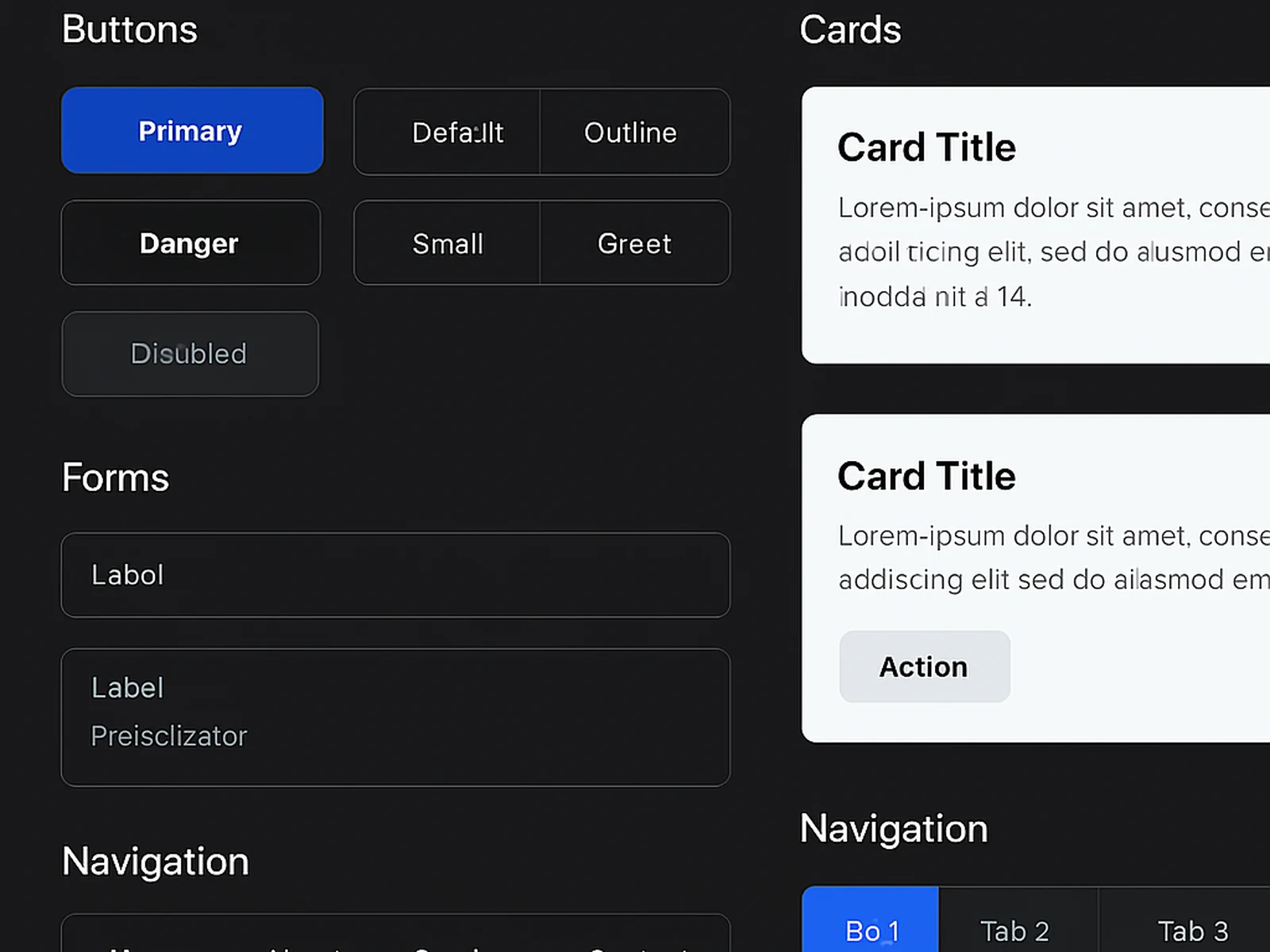
The process starts at the component level: button styles, form inputs, navigation states, data display patterns, typography hierarchy. These are established first so that when individual screens are designed, they are assembled from a consistent visual language rather than improvised per screen.
For each screen, we design the full set of states: default, hover, active, error, loading, empty, and success. This is the documentation that prevents the most common handoff problem — a developer building a loading state that does not exist in the design file, because the designer did not think about loading states.
Deliverable: a complete Figma file with all screens at all agreed breakpoints, all component states documented, all spacing and typography specifications annotated, and an export of all assets in appropriate formats.
In practice
Banca Sella digital arm improved their mobile app store rating from 3.1 to 4.4 stars in two update cycles after an interface redesign that addressed the three most common complaint categories in their reviews.
A Milan fintech startup increased their free-to-paid conversion rate from 7.2% to 18.9% within one quarter of launching a redesigned onboarding and upgrade flow.
Common questions
Start this
engagement.
Add it to a package or commission it as a standalone. We reply within one business day.